This Adobe software allows designers to create a link for clients and developers, where they can view the design and interactivity directly from the browser, without needing to install or download anything. This link is updated every time changes are made, and the user simply needs to reload the page to see them. The content displayed in this link corresponds to the designer’s artboard within the software (in fact, each screen corresponds to an artboard, and all artboards are contained within a single .xd file).
This link can be generated in two different ways: Share for review or Share for development.
Why do we need two different links to view the same design?
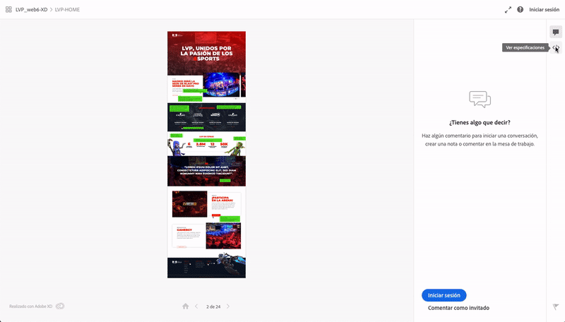
The review link, as the name suggests, is useful for the client to review and validate the design proposal. They will only see the design or interactive prototype (without downloadable images or unnecessary data). Therefore, they can view the proposal from a desktop or mobile browser quickly and smoothly. It also allows comments per screen, which can be sent as a guest or using an Adobe ID (which we recommend, since it sends email notifications when new comments appear, making feedback control more fluid and efficient).
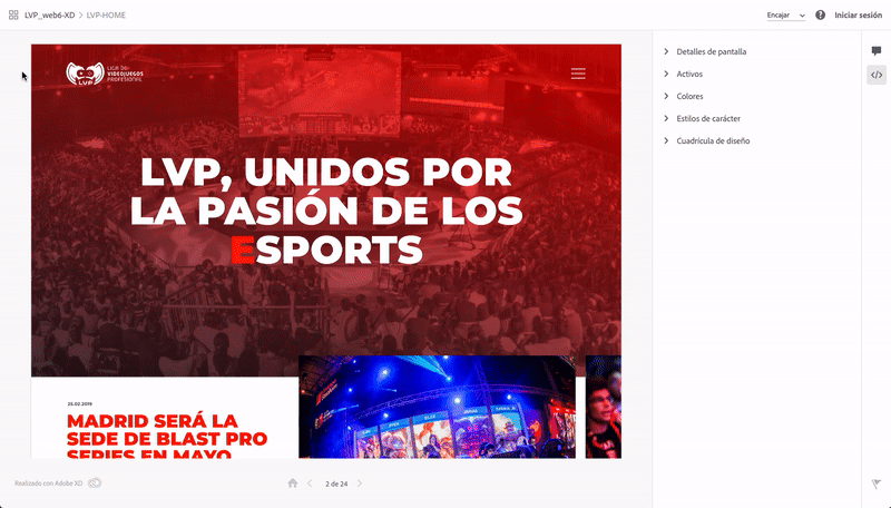
The developer link looks the same as the review link but adds the “View Specs” feature (a kind of inspector). This is where the developer’s part begins. From here, they can view, copy, or download the necessary resources for styling (colors, fonts, sizes, shapes, images, etc.) to accurately translate the design prototype into a functional website or navigable application.
General specifications of an Adobe XD screen
- Screen details
Pixel dimensions of the window and design layout. - Assets
Summary of all downloadable assets: bitmap or vector images (JPG, PNG, SVG, even PDF).
When downloading a JPG or PNG, two folders are generated depending on resolution (1x, 2x), useful for Retina displays. - Colors
Summary of all colors used in the screen. Clicking the color swatch automatically copies its hexadecimal value to the clipboard (it can switch between Hex, RGBA, and HSLA). - Character styles
Summary of all text styles used, including font name, weight, size, and color (can switch between px, pt, and dp). - Layout grid
Used to enable or disable the design grid. It overlays the design and its opacity can be adjusted for convenience.
The grid properties are specified if previously activated by the designer (columns, gutter width, column width, margins, and opacity).
Specific specifications of an element in Adobe XD
By clicking on an element, its properties appear in the right-hand column. These vary depending on the type of element selected (text boxes, images, vector shapes).
This is how we realize that with a single link, we can hand over the entire project to the developer and forget about sending huge folders full of images and icons that are hard to locate. This system allows the developer to click on any icon on the screen to download it directly, instead of digging through multiple subfolders. It may not seem crucial for a new project, but it’s extremely useful for small updates. However, designers should still prepare a set of JPG or PNG images. While XD allows you to specify whether you’re designing at x1 or x2, or export assets directly, the optimization of downloaded images isn’t ideal in terms of file size. Therefore, it’s better to prepare large images (typically fullscreen ones) in Photoshop or with a compression tool that minimizes quality loss. (This improvement has already been suggested on Adobe XD Feedback.)
Text boxes
When selecting a text box, the following specifications are displayed:
- Text
Displays the width and height of the box, its X and Y position on the screen, and rotation degrees. - Styles
A single box can have multiple text styles; all are listed here (usually no more than 3 or 4). If you click a deeper selection, only the chosen text style inside the box will appear.
Properties include: font name, size (px, pt, or pd), alignment, letter spacing, line height, and paragraph spacing. - Appearance
Text color and opacity in Hex, RGBA, or HSLA, automatically copied to the clipboard when clicked. - Content
Displays the full text content of the box, unformatted, and copies automatically to the clipboard when clicked. - CSS
Shows “Layout Properties” (margin top, margin left, etc.) and “UI Properties” (font, letter-spacing, text-decoration, etc.).
These can also be copied automatically.
Images
- Shape or image
Displays image width and height, X and Y position, and rotation degrees. - Appearance
Opacity (awaiting the addition of blend modes such as Multiply, etc.). - Asset
Downloadable file name and available options: JPG, PNG, SVG, or PDF. - CSS
Shows “Layout Properties” (margin top, margin left, etc.) and “UI Properties” (border-radius, opacity, etc.).
Shapes
- Shape
Displays width and height, X and Y position, and rotation degrees. - Appearance
Opacity, color and border size, end type (e.g., rounded), and join type (e.g., round). - Asset
Downloadable file name and available options: JPG, PNG, SVG, or PDF. - CSS
Shows “Layout Properties” (margin top, margin left, etc.) and “UI Properties” (border-radius, opacity, etc.).
If the shape is simple, instead of downloading the asset, it can be drawn directly in code using its CSS translation:
1background: transparent linear-gradient(46deg, #FFAF00 0%, #D98B1A 84%, #EBBE24 100%) 0% 0% no-repeat padding-box;2box-shadow: 0px 0px 6px #1D0628;3opacity: 1;
If it’s a complex or grouped vector, the linked asset will appear.
1background: transparent url('img/ic_tic.png') 0% 0% no-repeat padding-box;
For now, what our developers miss most is some kind of ruler or rectangular tool to measure specific pixels. Adobe XD shows distances between elements and their dimensions on hover, but sometimes it’s not enough, and they need to measure something specific. Luckily, Adobe is already considering this feature request.
For designers, this saves a considerable amount of time marking spaces, pointing out small details, and creating style guides for each paragraph.
Adobe XD versus its competitors
Much has been written online about XD vs Sketch (their rivalry will be epic) and other wireframing or prototyping tools (such as Figma, Mockflow, Marvel, Moqups, InVision, Canva, Wireframe.cc, and many others).
This article doesn’t intend to list advantages or disadvantages of XD compared to other tools, nor to turn anyone into an Adobe fan. It’s simply the software we use and find comfortable, simple, and clean. Usually, articles focus on designers’ perspectives, so it seemed honest to explain some of this tool’s utilities from the developer’s point of view (with permission to borrow their dev identity for a while 😄).
More about Adobe XD
Adobe Experience Design is a vector graphic editor developed by Adobe. This tool is used to design, prototype, and wireframe UX/UI for websites and mobile apps. It also integrates with Jira, Slack, Zeplin, Microsoft Teams, ProtoPie, Avocode, Sympli, and Kite App. From the designer’s perspective, it supports countless third-party plugins (mostly free) that enhance functionality and create a very interesting ecosystem.
The initial release was in October 2015, and it has been constantly evolving thanks to the user feedback system: Adobe XD Feedback: Feature Requests & Bugs. Since then, Adobe updates the software monthly with the most upvoted user suggestions, so every month we look forward to discovering the new features and improvements.
And if we don’t know how to do something, their official blog explains it.
#adobexd#layout#uxui#wireframing